what this is
Markets Panic. Investors Prepare.
Recession Investor is a weekly market-risk and valuation dashboard for investors who want to prepare before downturns, stay calm during volatility, and identify opportunity when markets misprice fear.

Latest Market Score [June 2026]
Valuation
Expensive. Major valuation indicators are elevated compared with history. Shiller CAPE is around 41.6, the Buffett Indicator is around 238%, forward P/E is above 20x, and dividend yield is close to historic lows. The market is not cheap.
Risk
Cautious, but not panic. VIX is elevated at around 21.5, but credit spreads remain tight at roughly 2.7%–2.75%. That suggests investors are alert, but credit markets are not yet pricing serious stress.
Trend
Still positive, but narrowing. The S&P 500 remains above its 200-day moving average, which supports the trend. However, market breadth is only around 58% above the 200-day average, meaning the rally is not especially broad.

Where are we in the cycle?
The Market Cycle Clock helps investors interpret the emotional rhythm of markets. It shows how sentiment can move from confidence to complacency, then to fear and recovery.
This is not about calling the exact top or bottom. It is a simple weekly reference point to add to the rest of your market thesis.
A recession is not just a GDP statistic

and markets often sense it before economists name it
A recession is usually understood as a broad and sustained decline in economic activity.
The simple rule of thumb is two consecutive quarters of falling real GDP. That is the common “technical recession” definition used in many markets.
The United States uses a broader business-cycle approach. The NBER looks beyond GDP and considers the depth, duration and spread of weakness across the economy, including income, employment, production and sales.
For investors, the key point is simple: markets often move before the official recession label arrives.
latest indicators [june 2026]
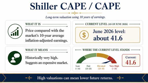
Long-Term Valuation
Compares today’s market price with ten years of inflation-adjusted earnings. It smooths the cycle and helps judge whether the market is historically cheap, fair, or expensive.

Market vs Economy
Compares total stock market value with the size of the economy. When the market becomes very large relative to GDP, future returns may be more constrained.
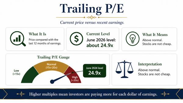
Current Earnings Price
Measures today’s market price against the last twelve months of earnings. It shows how much investors are currently paying for each dollar of recent profit.
Expected Earnings Price
Compares today’s market price with expected earnings over the next year. It reflects investor optimism, but depends heavily on whether forecasts prove accurate.
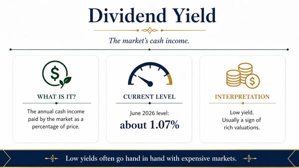
Income Return
Shows the annual cash income paid by the market as a percentage of price. Very low yields can indicate expensive markets or lower income return.
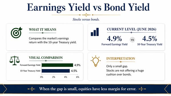
Stocks vs Bonds
Compares the market’s earnings return with bond yields. When the gap is small, investors may not be receiving much extra reward for equity risk.
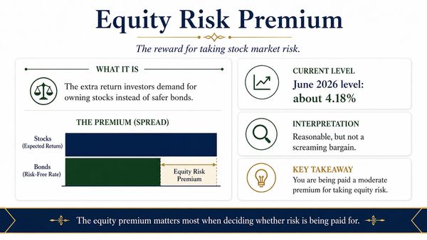
Reward for Risk
Estimates the extra return investors expect from shares over safer bonds. A higher premium suggests better compensation for risk; a lower premium suggests less margin for error.
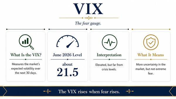
Fear Gauge
Measures expected volatility in the S&P 500 over the next thirty days. It is often called the market’s fear gauge because it rises when uncertainty increases.
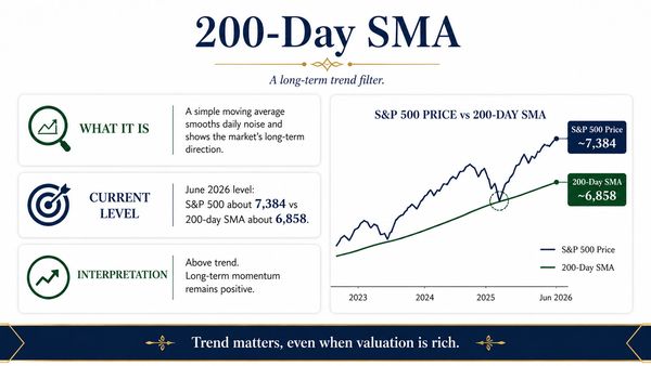
Trend Filter
A long-term trend filter that smooths daily price noise. When the market is above its 200-day average, momentum is generally healthier; below it, caution increases.
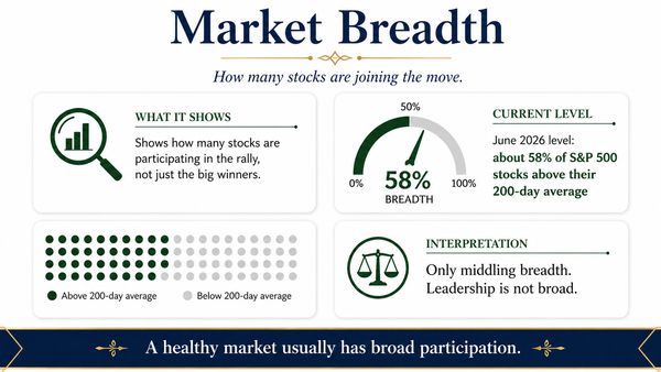
Rally Strength
Shows how many stocks are participating in the market move. A healthy rally is usually broad; a narrow rally depends too heavily on a few winners.
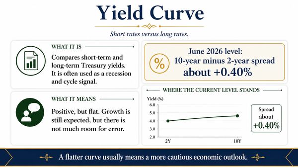
Recession Signal
Compares short-term and long-term bond yields. A flat or inverted curve can signal caution, while a healthier upward slope often suggests stronger growth expectations.
Credit Stress
Measures the extra yield investors demand to own riskier corporate debt. Tight spreads suggest calm conditions; widening spreads can signal rising stress and recession risk.